
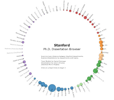
There is little question that data visualization is becoming an increasingly powerful tool as more and more people are able to access the explosion of software options and use that software to view their data. This data visualization project from Stanford is particularly interesting. It allows you to click on a discipline and then see how that discipline relates to other disciplines based on Ph.D. dissertations written at Stanford 1993-2008.

You can click here to see it live. Having seen how it works, the next thing is to ask what it means. What does the visualization tell us? What new information is created by the various combinations of existing information that was loaded into the software?
You will see that certain disciplines have had more dissertations written within them than others. Some are more isolated than others. Education and sociology have an interesting (though not surprising) connection and if you look at economics, you'll see interesting approaches from disciplines in different parts of the circle. The gray shadowing gives a sense of what the overall representation is before you start clicking. If you move the slider to the far left and then use your arrow keys, you can see what happens year-to-year within whatever discipline you've selected. Another interesting one is that ethics scarcely moves the medicine/biology groupings at all.
If you took all universities and all disciplines over time, you would have a clear sense of where the intellectual investments have been made over time. Overlay funding, grants, publishing, commercialization and other data sources and a very intriguing dynamic of higher education would be created.
No comments:
Post a Comment